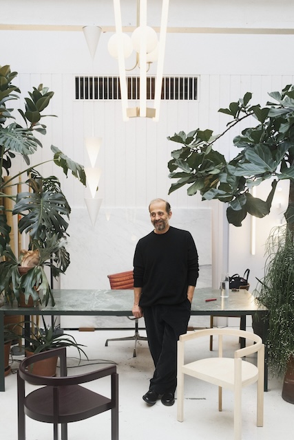
Christian Flindt
A series of short interviews about how creative professionals play at work. In the fourth instalment, we hear from designer Christian Flindt.
What is the value of play in design?
When I started to be interested in lighting, making lamps and following the emerging technology within this field, I was invited to take part in a competition by the Danish furniture association. The task was to do a children’s piece of furniture but with an “extra dimension”. I chose to mix the traditional rocking chair and (at that time, the brand new) LED technology. When you rocked, “LED-light-water” would splash or tumble inside the chair. It also had an educational dimension—different rocking patterns would display differently—some more chaotic, some fluid and harmonious. So, this is an example of a very playful design idea and a playful result. Getting there, however, included many devils in the details. It was getting ergonomics and the rocking just right. It was getting the right LED’s, finding a way to integrate and diffuse the LED light just right. And in the end, monitoring the chair's movement through sensors and making software that would translate these movements into something that would look and perform like “light water”, this part was a chapter on its own.
This might be the most playful product I have done; it is also an excellent example of how a project, if you want it to succeed, will invite and challenge you to seek solutions and expertise from people that know more about specific stuff than you.
To me, these unpredictable dialogues and relations in the process of designing are essential to elevating your idea. It is also what makes each design process new, exciting and playful.
{{pullquote}}
As a designer, how do you use to play in your creative process?
For the Danish lighting manufacturer Louis Poulsen, one of my latest products is a 6-meter-tall outdoor park lamp. Even though it might sound dry and grownup compared to a rocking chair with interactive light, to me, it involves a lot of “play”. A regular park light’s job is to give an even light around it so that people can see where they walk—a bit like a ceiling lamp in a room. The Flindt Plaza is more like a floor lamp next to your couch to use for reading, other activities or just for a cosy feel. With this multi-directional urban floor lamp, you can light up a group of benches, and a fountain, accentuate urban elements or create light compositions at a big plaza to create a certain feel from an intimate to a more dramatic theatrical light setting.
A product like this with many light sources, which should all be flexible and adjustable, can quickly look very technical, with clumsy “photo-spots” mounted on the outside of a long pole. We have integrated all these spots into a pole, sliced it and stacked these cylindrical lights on top of each other. It is a “totem” of light that lighting designers and architects can compose themselves. We have tried to keep this “totem” in a minimalist language, yet with simple cuts discretely revealing where the light comes from within the pole. At the same time, the sculptural cuts are illuminated in a textural and gradient disappearing light effect.
What advice would you give to those who wish to incorporate more playfulness in their work?
The main challenge is always to realise a simple idea on paper and keep the same expression of immediacy, effortlessness, and playfulness in the end design. There is often a long excel sheet of things you must tick off and integrate into your plan to make it work and be successful in the real world. In the case of Flindt Plaza, there were outdoor regulations from different countries regarding water tightness, salt-erosion, handle maximal wind load (even for Japanese standards). It should be easy to produce but not too easy so that it is still difficult for others to copy and so on… So, you need to know about most or some of this stuff. Things could look like an obstacle, but later they will become teammates on a playground that will be more defined and more fun.
I think you need to be both a child and a grown up to make good design. I don’t think you can necessarily analyse and calculate your way to a new, never seen, and successful design. I think you also need to listen thoughtfully and be open to the ideas of the naive and curious child.
At 3daysofdesign, our commitment extends beyond showcasing the latest trends in interior design and furniture. We strive to facilitate meaningful discussions, debate, and actively contribute to pushing forward a more sustainable approach within the realm of interior design and furniture business. Join us in our mission to inspire positive change and promote a greener, more responsible future for the industry.


