10 Years — 10 Posters
In 2023 3daysofdesign celebrates the 10 year anniversary of the festival. For the previous ten years, 3daysofdesign has asked a variety of talented, international designers, artists and architects to create the annual poster. In this article we go back in time to hear their ideas behind the designs.
Festival Year: 2014, 2015, 2016
Poster Design: GamFratesi

What was the inspiration behind your design for the poster?
The posters for 3daysofdesign aims to represent the city of Copenhagen in a playful way.
The city with its showrooms, shops and galleries is the center of 3daysofdesign and for this reason it had to be told as an image in the communication of the poster.
We designed the first 3 posters and for us it was essential to communicate the city through hand drawings and small models. We love to draw by hand and for this reason it was pleasant to discover and represent characteristic places or little unknown corners of the city.
What ideas or feelings did you hope to communicate through your poster design?
Copenhagen has a strong poster tradition and we wanted to reinterpret this spirit of the Danish graphic tradition with a new contemporary communication
We honestly could not have imagined that 3daysofdesign would become one of the most important events in the design sector and we are very happy to have been the authors of this communication at the beginning of this adventure.
Festival Year: 2017
Poster Design: All the Way to Paris

What was the inspiration behind your design for the poster?
We wanted to evoke and create the thrill of the festival and that it was all yet to be unveiled. You could see the contours of something exciting but didn't know what to expect. A sense of surprise in the unveiling.
What ideas or feelings did you hope to communicate through your poster design?
The covered pieces of furniture represented the festival as a whole but also the many different brands and their products to be presented during the three days.
Festival Year: 2018
Poster Design: Henrik Vibskov

What was the inspiration behind your design for the poster?
I was looking into a mix of cartoon illustration, oldschool graffiti artwork and a blue black color from old posterdesign from the 50’s.
What ideas or feelings did you hope to communicate through your poster design?
I related it to 3daysofdesign by using the symbolism of different design objects and used them to create the letters.
Festival Year: 2019
Poster design: Jaime Hayon

What was the inspiration behind your design for the poster?
I tried to make with my lines something very personal, as I normally do, trying to bring my world of traces and forms into the graphics… Something joyful and simple yet rich in perception comes alive.
What ideas or feelings did you hope to communicate through your poster design?
I always try to communicate the power of tracing/linework (can you see the face?)… It brings happiness and definitely an eye blink... I try to think about humour and the power of surprise design can have.
Festival Year: 2020
Poster Design: Alfredo Haberli

What was the inspiration behind your design for the poster?
Due to the circumstances of the world (the pandemic) and the resulting economic context, I wanted to guide the visitors with as few mediums as possible, in this case by using black and white with few lines to convey exploring the festival on foot, by bike, bus or boat. I wanted to represent this graphically.
What ideas or feelings did you hope to communicate through your poster design?
With a lightness or "en passant" about the exhibitions, the showrooms, dinners and cocktails, and meeting professionals and friends.
Festival Year: 2021
Poster Design: Ilse Crawford

What was the inspiration behind your design for the poster?
The 2021 graphic identity embodies my approach of engaging with the human experience through design. The head, heart and hand all represent key touchstones of the Studioilse design process: the hand represents craftsmanship; the head, observation & creativity; the heart, empathy and compassion.
What ideas or feelings did you hope to communicate through your poster design?
The simple layering of hand-drawn shapes speaks to the Studioilse design process, evoking an apparently uncomplicated sense of ease and connection. Design creates a frame for life, it makes us feel human, it makes us feel alive.
Festival Year: 2022
Poster Design: Luca Nichetto

What was the inspiration behind your design for the poster?
Whenever I’m faced with a design dilemma, I remember to play: it opens up new possibilities, sparks my curiosity and adds elements of fun to my projects and collaborative partners. I decided so to “let it go” and I ended up combining the idea of fun with a collage of Danish icons: a famous design, a typical dish and an architectural landmark in Copenhagen.
What ideas or feelings did you hope to communicate through your poster design?
I wanted to communicate exactly to “Remember to Play”. Often we are so dragged in our work and operational things of everyday life that we forget about playing, about having fun, about being happy. Sometimes it’s important to have inputs that reminds us to not take everything too serious.
Festival Year: 2023
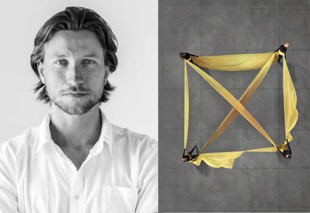
Poster Design: Rasmus Hjortshøj

What was the inspiration behind your design for the poster?
It all started with me sitting with the 3daysofdesign team for several days, discussing how to translate the theme into a strong visual expression, how to show that the city, nature and people are all connected, how we humans are connected and depend on each other. I suggested a square at Amager Strandpark, and artificial landmass reclaimed from the sea, paved in a perfectly shaped concrete grid that sums up the entangled situation between the modern city and it's surrounds. We worked with a group of creative professionals, all connected physically by forms of woven textiles. They affected each other physically and created spaces between them: the square and the cross in the square.
What ideas or feelings did you hope to communicate through your poster design?
'Where Would We Be Without You?’ is a critical question for the design and architecture industries. Towards the past and those who paved the way before us and who created what we continue to build on, as well as the present. We should preferably not be in a situation where future generations think “we would have been so much better without you.” We are committed to learning from the past to make the world better because everything is connected.
At 3daysofdesign, our commitment extends beyond showcasing the latest trends in interior design and furniture. We strive to facilitate meaningful discussions, debate, and actively contribute to pushing forward a more sustainable approach within the realm of interior design and furniture business. Join us in our mission to inspire positive change and promote a greener, more responsible future for the industry.


